
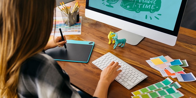
Graphic design is an exciting field. It may seem daunting as you begin to create your own images, but becoming a graphic designer is just like learning a new language – you start with simple words and phrases and gradually build your way up to more complex topics.
Studying graphic design can be a lot of work, especially if you haven’t had any prior experience in it before. It can be pretty overwhelming at times to handle, but don’t worry – we can ease your load a little bit! With this website, you can hire a professional paper writer to help you! You can get professional 24/7 help with any paper topic at an affordable price – and a free plagiarism report, too! Make sure to check them out and save your precious time for more important tasks!
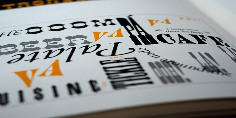
Experiment with fonts
Fonts can make your titles look more prominent, your body text look bolder, and better still, they can make your images look more immersive! They’re tools in a designer’s arsenal and should be used creatively rather than strictly for aesthetics.
Fonts are powerful tools in the hands of an effective artist! They can help communicate your ideas constructively and suggest alternatives. A particularly useful typeface can help you make your points clearer and more persuasive, as well as give off an emotion you desire.
Go big or go home
When starting out, many beginners make a mistake by getting too focused on the details. This usually leads to something less than stellar. It is easier to create a simple but effective art than a complex but ineffective one.
If you want to become a top visual artist, you need to handle large objects and elements in your art effectively. Sometimes, the most important thing is that you use your eyes and not your brain.
Use contrasting colors
Colors can be used in many ways when it comes to creating. Since color can affect the mood of an image or presence, it’s essential to use colors that will stand out against the background.
Black and white palette is also an excellent way to communicate a message or emphasize a certain point. Although there are many ways to use colors in art, one very effective way is by contrasting them using different hues. As an example, two different hues can be used in one design to convey entirely different messages!
Sketch your ideas
When starting out as a graphic artist, it can be helpful to think that the most powerful tools are pencil and paper. Make a fresh start by drawing with markers and practicing drawing in perspective before moving on to larger, more complex pieces.
Playing around with perspective and shape reminds you that whatever you draw will ultimately be a manifestation of your creative process.
Use consistent images
As a beginner, it is easy to get carried away by the many choices available. It is tempting to look through each image type and decide the best option. You can do that, of course, but keep in mind that consistency is key in choosing images!
While there are many different types of images available, follow a few simple guidelines when selecting them. There are many platforms that offer free logo design. Consider using an AI image generator to create unique and high-quality images that align with your content’s message while following a few simple guidelines when selecting images. Make sure they’re of similar:
- color palette
- size
- feel
- motif
- Style
Be consistent in general
When starting your graphic design, you will need a lot of visual tools. But choosing the best is not so simple. You should try to understand how colors, lines, and shapes work together and try new techniques to get more varied and exciting patterns. Playing around and experimenting is always a way to go!
But keep one thing in mind – try to be as consistent as possible. That doesn’t mean not having variety; it means giving structure to your work.
Summary? Be consistent with your fonts, images, paragraphs, and overall style!
Use symmetry and balance
For a graphic artist, the difference between good art and great art can often be found in the subtlety of a line or the balance between colors and letters. Symmetry refers to how similar two elements are in shape, size, and color, and balance indicates that different parts of an object or image are in harmony with each other.
Implementing both in your artistry is essential – they give off a professional vibe. And not to mention, humans are wired to love symmetry; use it to your advantage!
Get inspired by the best designers out there
Graphic design is an ever-changing field that offers endless opportunities for those willing to put in the hard work. Each new designer presents their own style, method, and inspiration!
Learning from them will allow you to follow their lead as they break new ground in their own unique way. As you become more experienced and gain knowledge about the industry, you’ll become an artist others will look up to!
Implement shadows
Shade and light is an essential part of any art. They help direct the viewers’ attention where you need it to be. They also play an important role in gradients, color palettes, and texture.
Shadows are one of those magic features of light that can make your pictures look much more vivid. They help draw your eye from one part of the picture to another and create a sense of depth and atmosphere. They add dimension and clarity without adding much bulk or distracting from the main composition. Learn how to use them effectively and see the difference for yourself.
Start with flat design
It may not be what you wanted initially, but once you get used to it, you’ll find its strength is in its simplicity. It’s always been easier for artists to get started with flat design because there are fewer rules to follow. You can still create beautiful things, but you need to think more logically and strategically to do them well!
Before choosing your first program, it’s a good idea to learn about flat design. Flat is easy to follow and understand – since there are no complicated rules or guidelines to follow, it can be a great way to gain confidence in your artistic abilities!
Keep it simple
The most powerful graphic design beginner tips are all about keeping things simple. Ensure that the colors you use are complementary, that the shapes are consistent, and that all the elements in your art fit together seamlessly.
The more complicated an artwork becomes, the harder it is to make and relate to it. With too many options, it’s easy to get distracted – so choose one basic graphic design technique in a project and try to stick with it! Keep adding details only when they’re more than necessary, and make sure those details really do make a difference.
Practice, practice, practice!
Learn by doing. When you practice a skill, you become better at it. Even if you don’t have formal art training, you can go and practice on your own! See how many resources are available to help you learn more about graphic design and keep growing!
Becoming a master designer takes time and practice. Arm yourself with patience and persistence – they’ll lead you to places you’ve never been before!
The wrap-up
Graphic design is the art and science of visual communication. Always looking to push the boundaries of what is possible, graphic designers create visuals to engage with their audience. Their work expresses their ideas through form and color, and their goal is to communicate something through their work that has not been said before.
If you’re a beginner designer, realize that the world is patiently waiting for you! By implementing some of these steps, you’ll be recognized as a successful, brilliant artist others will look up to with admiration!
