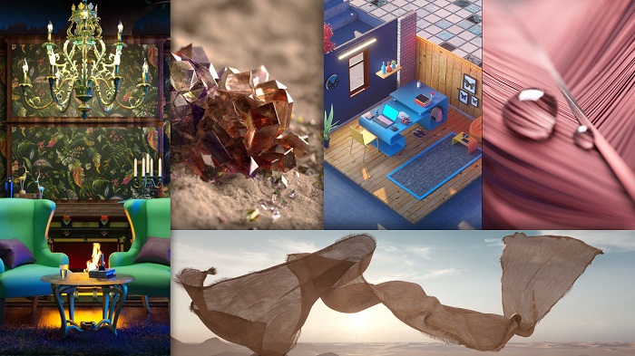
Post Office Studios conceptualised and produced five animated films to launch Asian Paints’ Colour Next series this year, which were released at country’s most definitive design and home decor week, India Design ID, in mid-February.
Every year, Asian Paints launches an expertly researched and curated set of trends that reflect the aesthetics of our times, along with a carefully handpicked colour of the year; all of which they later translate into home décor ranges drawing inspiration from the same. The four diverse trends this year are Adulting, Enchanted, Harvest and Flux, in addition to Asian Paints’ Colour of the Year for 2019: Awakening.

In order to best showcase these trends to the audience, the team at Post Office largely used 3D motion graphics to set tone to the visuals, seamlessly integrating the elements and thought process encapsulating these trends into a single narrative. Around 15 different artists with distinct creative styles worked on the films, all meticulously selected to match the visuals concerned. The creatives, too, were designed to complement and bring out the year-long research undertaken by Asian Paints, rather than override the same in any way. The videos are thus reflective of a unique collaboration between a pioneer in design, Asian Paints, and an upcoming new media technology company that is focused on innovative storytelling- resulting in the creation of a set of 3D animated films that are rarely seen in commercial advertising space in India.
Post Office Studios director of the film and chief creative officer Aditya Tawde said, “When Asian Paints approached us with their Colour Next brief, we were very excited to work on the project, due to its immense creative potential and the free reign that Asian Paints gave us in terms of treatment, as long as it drew from their research. We immediately did a few brainstorming sessions and conceptualised five unique ideas to match each trend. We then spent sufficient time detailing the particulars; while the films had a similar undertone, they were given distinct tonalities and visuals, complemented by music and voice overs that did justice to the theme concerned. The biggest challenge for the team was to execute all the five videos in just a month, which was difficult both technically as well as creatively, if a certain standard needed to be achieved. Since commercial briefs in India are rarely this avant-garde creatively, we wanted to push the creative boundaries to the extent possible. We therefore collaborated with 12 artists based out of countries such as USA, Russia, Belgium, Poland, UK, Italy, Spain and Chile, who worked in sync with our talented team based in Mumbai.
The team is particularly proud of the manner in which they have approached the Colour of the Year video, which was an amalgamation of grand visuals created by nine artists from across the globe, all tied together by their colour, Awakening. Being able to showcase a number of unique creative perspectives on a single colour gave the studio an opportunity to truly showcase our skill sets, and we’re very glad that we were able to successfully execute the same.”
