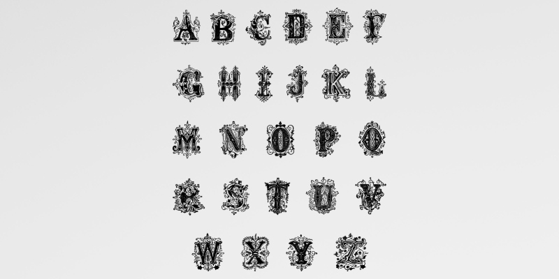
It’s always handy for animators to keep up to date with trends in the industry, as this helps you stay competitive and keep ahead of the curve. Kinetic typography is one of the latest innovations that has swept the animation sphere in recent years, and it’s something that everyone should be aware of. It’s designed to make text look more visually appealing and is becoming a powerful eye-catching tool for advertising.
What is kinetic typography?
With more people reading text in a digital form than ever before, it’s crucial that the words are readable and enjoyable to look at. That’s where kinetic typography steps in. This is a technique of animating text so that it has dynamic movement, and can range from simple ideas like wobbling to more complex animations where it will interact with other elements on the screen.
There are endless applications for kinetic typography, and it has been making a mark in everything from marketing to cinema. The sprawling online world provides users with an endless array of choices in every industry, so techniques like kinetic typography can help brands grab peoples’ attention.

Animation technique can make brands stand out
Various companies offer kinetic typography services to help brands stand out in this sea of online options. For instance, in New Jersey, there are companies such as WSPR Creative that specialise in offering kinetic typography services to brands. The state is one of the most technologically advanced regions in the USA, so it’s no surprise that this is a hotspot for innovation in animation.
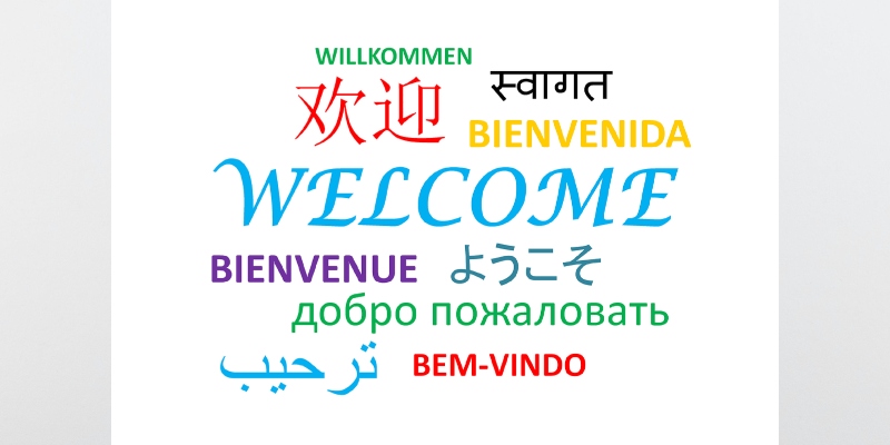
Numerous apps in the New Jersey region have been getting recognition recently thanks to their adaptability to modern animation trends. For instance, a top NJ mobile casino recently launched with a nifty welcome animation that takes players on a virtual tour of its casino offerings on the home page. It doesn’t use kinetic typography yet but, judging by its willingness to incorporate state-of-the-art technology, it may do so in the future.
This animation technique could come in handy with its marketing, particularly when considering user accessibility and engagement via platforms like the App Store. Though thumbnails are often striking and informative, additional animation would only further enhance a brand’s presence, especially when presented in a spread among countless other competitors. This feature could be the difference between somebody scrolling past with no thought or pausing to look into more details about the app.
What’s next for kinetic typography?
It’s an exciting time for Kinetic typography, and there could be many future developments in the field. It’s continuously evolving, driven by advancements in technology and design. For example, we’re now seeing trends like the integration of 3D design, which adds depth and lifelike quality to the text. There’s also a growing trend of merging live action with animation, blending reality with imaginative text movements.
Animators who want to level up their toolkits with a fresh way of displaying text should master kinetic typography. This technique is sweeping the internet, and it appears as if it is only going to get bigger.


