Marvel’s Avengers: Infinity War was a blockbuster in more ways than one. Not only did Thanos triumph in his pursuit of banishing half of humanity with the snap of his fingers, but MCU’s magnum opus also set the cash registers aflutter world over.
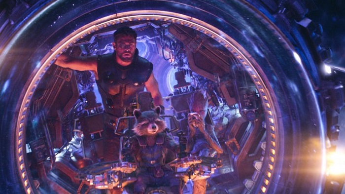
Replete with eye-catching visuals and CG characters, as many as 11 studios came on board to pull off the VFX treat that the movie delivered. Method Studios was a part of the expansive team too, creating some of the instrumental scenes in the film, primarily the ones featuring the Guardians of the Galaxy.
VFX associate producer Julie Osborn and animation supervisor Keith Roberts come together to give further insight in what went into the making of one of the biggest superhero movies of all-time:
How did Method Studios got involved with the project?
Keith Roberts: We had worked with Dan DeLeeuw and Jen Underdahl on Captain America: Civil War the year before and had also worked on several other Marvel projects prior to that.
Julie Osborn: We had a great experience working with them and so, when the opportunity arose to work with them again on Avengers: Infinity War, we jumped at the chance.
You worked on the scenes involving the Guardians of the Galaxy. Can you tell us more about their new ship you made?
Julie: The ship and its escape pod were designed by production designer Charlie Wood and his Marvel art department team. Our VFX supervisor, Greg Steele, was able to spend some time with him on set discussing the design to get a better understanding of the materials, shapes, and history of the vehicles as well as what areas they wanted us to elaborate on. This helped give us a great starting point with the models, textures, and lookdev.
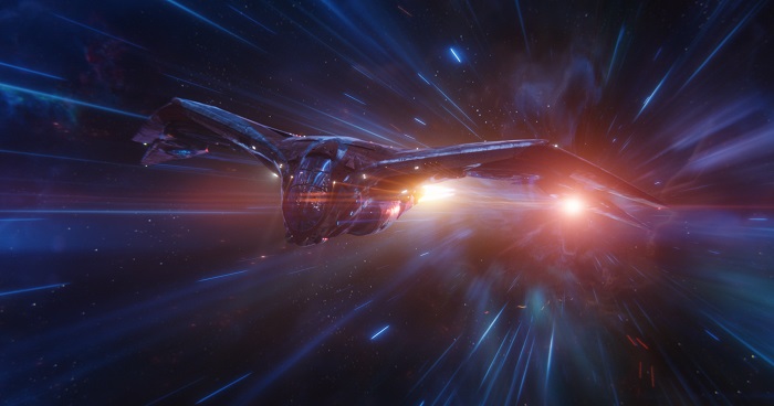
We then fleshed out the sections that weren’t covered in the initial designs with our art director Ming Pan. He did paint overs to detail out certain parts of the ships and how they should move holistically with everything else and then our asset supervisor Fernando Zorrilla worked with our asset teams to make it a reality.
For the interior, there were two parts of the ship on-set: the two-story flight deck that was mounted on a gimbal and the interior galley where Thor meets the guardians for the first time. We had to merge these two sections together using 2.5D projections on accurately rebuilt interior geometry to achieve the desired look for our shots.
Groot has grown into a teenager now. How did you go about his design? Were there any specific design requirements asked of you?
Julie: The look of teenage Groot was driven by the Marvel art department and a beautiful maquette that was sculpted by Legacy Effects. Our asset team worked tirelessly to recreate those designs while taking into account how Groot’s vines needed to move as cohesive pieces from toes to neck to fingers.
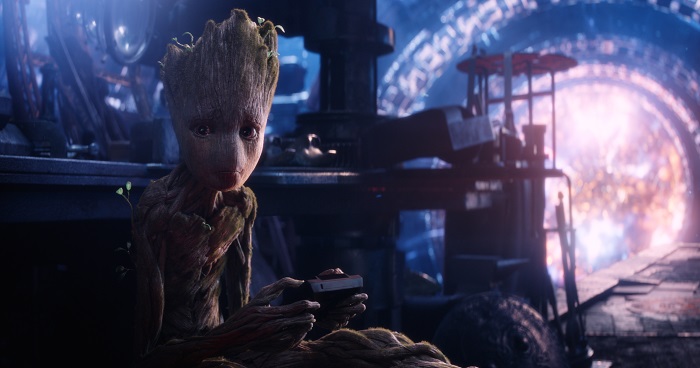
Keith: From an animation design perspective, we used my 16-year-old son Quin as reference. When we got the brief that Groot needed to have a teenage personality I started thinking about the overall posture of a teenager. In the 1990s, the comic Harry Enfield had a teenage character called Kevin who was very funny. Kevin was too extreme, but it helped to crystalise the character, and led me to realise that I had the perfect reference at home. We shot video footage of Quin just naturally walking up and down the street, his head hanging and arms flopping as teenagers do. We sent this footage to Danover at Marvel and he liked the direction we were going, so we built from there.
Also, did you make any changes in Rocket’s design too?
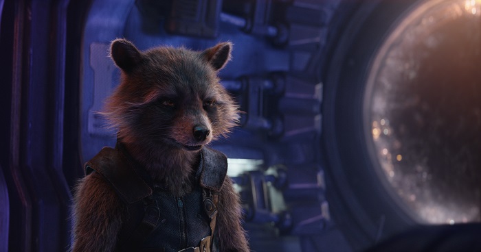
Keith: We tweaked Rocket a little from the asset we used on Guardians of the Galaxy Vol.2 that was originally created by Framestore. We added controls around his eyes, including an improved corneal bulge deformation effect, and altered some of the face shapes.
Julie: The fur was also different in texture and tone as we both switched over to an XGen fur system inside of Maya and also spent extra time to refine the fur shades to achieve a more natural spectacular result. Our rigging/techanim supervisor Ryan Rogers and his team also developed a full body skin-slide system that gave us the much more sophisticated distribution of skin over muscle and bone. It also helped the fur move more realistically when simmed.
There’s one scene that captures the sprawling Nidavellir. Can you enlighten us about its making? Did you take any references?
Julie: The Nidavellir environment, including the Dyson Sphere that surrounds the dying star and the Forge where they first find Eitri, was our biggest asset build for the show. We spent many weeks planning and developing the best way to build such a large structure while being able to maintain high-level detail in extreme close-up shots as well as wide establishing shots.
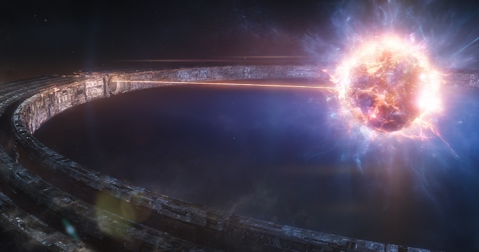
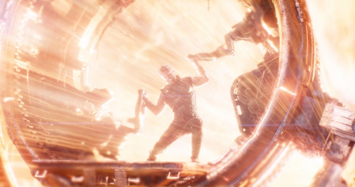
There were only two areas of the practical set, the gear platform that Thor manually turns to release the energy of the star and a 40×40 ft area in the forge where Eitri’s work table and crucible were. Depending on the angle, we either augmented those sets with massive 3D extensions or replaced them entirely with our CG assets. There was exhaustive on-set photography that we used as a reference for these recreations.
The dying star is reignited by Thor, a scene that’s captivating to watch. How did you create the VFX for that?
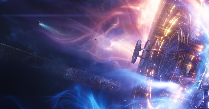
Julie: Our FX supervisor Pouyan Navid and his team worked closely with our three sequence supervisors Brandon Nelson, Kodie Mackenzie, and Pieter Van Houte to provide interesting, unique, and layered FX elements for these shots. Some of the larger effects like the Dyson Sphere plasma and energy beam were developed based and went through a few rounds of revisions with Marvel before we settled on the final look.
Keith: We made some enhancements to Thor and Eitri and, of course, Rocket and Groot were fully digital. For Groot, Terry Notary acted as a stand-in as part of the original plate photography which we used as a reference as well as Sean Gunn for Rocket. We tackled animation in the same way we did for the rest of the show—kit bashing together reference from Terry/Sean, our animators, as well as mocap sessions of Jordan Miller, TJ Storm, and my son Quin. The animation was almost always 100 per cent key framed.
Which was the most challenging VFX shot for you?
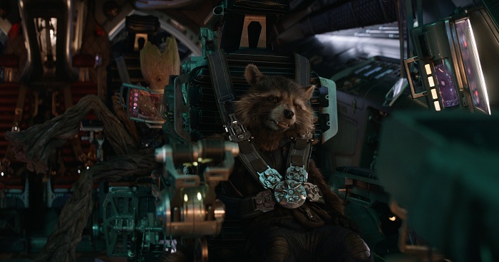
Keith: The most challenging scene for animation was when Rocket is having a somber conversation with Thor when he is grief-stricken inside the escape pod on their way to Nidavellir. It was quite a personality departure for Rocket as he had to quietly listen and be sympathetic to Thor’s sorrowful tale. It was a fun to explore this new side of him. We started first by shooting reference with the animators—we shot multiple takes of each shot and then picked the takes we thought had the best performance that would work in the arc of the whole scene. We then blocked out the animation beats and showed them to Marvel for feedback. If they liked the direction we were going in, we then fully finished the animation with the help of Bradley Cooper face reference which we used for nailing the lip sync.
Your experience of working with the Russo brothers?
Keith: We mostly worked with DeLeeuw who acted as our conduit to the directors. We had a pretty good shorthand with DeLeeuw, we would cinesync at least once a week and he would give us notes based on his reviews with the directors. The feedback was clear and straight-forward which was nice.
How long did the project go on for?
Julie: It was about a year from April 2017 to April 2018.
What’s next at Method Studios?
Keith: Method has grown massively since I first started five years ago. We are now location agnostic and that makes us able to build on our strengths and do much larger work more efficiently. I’m looking forward to some cool, diverse animation projects in the near future!

