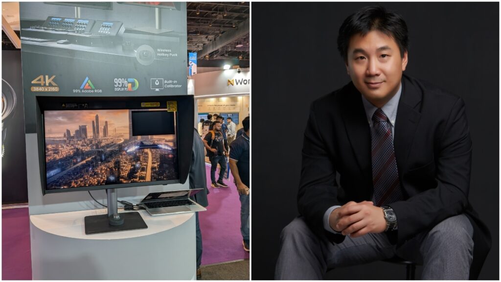
At Broadcast India 2025, where cutting-edge tools meet the creative minds shaping the future of media, AnimationXpress caught up with BenQ senior colour expert and colour technology lab manager Dr Chris Bai for a deep dive into the PD2770U – BenQ’s latest professional monitor designed for post-production, broadcast and studio environments.
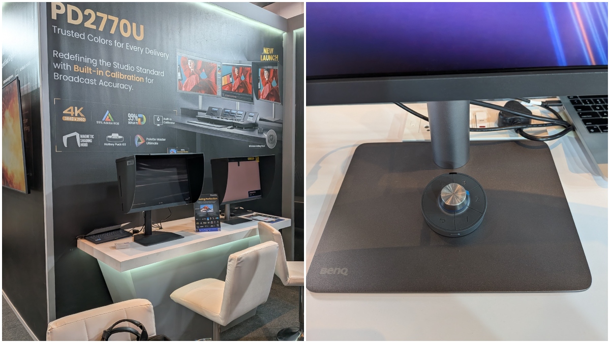
The PD2770U is designed to support accurate colour work and smooth workflows. It includes a built-in hardware calibrator and three-level uniformity technology to help maintain consistent colour across the screen. With wide colour coverage, Pantone and Calman certifications, and practical features like the Hotkey Puck G3 and KVM switch, it’s a reliable choice for professionals working in post-production and broadcast.
In this conversation, Bai shares his thoughts on BenQ’s approach to colour technology, the changing needs of both creative and technical users, and how feedback from professionals helps shape tools. He also touches on the future of display colour science and what it could mean for those working where art and technology meet.
How does the PD2770U’s built-in hardware calibrator differ from traditional external calibration tools in terms of accuracy and convenience?
I believe it’s important to have auto-calibration units built into monitors. We’ve been discussing colour management for many years, and we’ve had great success using external calibrators with our Palette Master Ultimate (PMU) software. With PMU, it’s possible to achieve an average Delta E of less than one. We apply our proprietary algorithm and embed it into the sensors. This approach offers the convenience of not requiring users to have calibration expertise in order to maintain colour accuracy. For instance, in a team-based environment, an IT personnel can handle the administrative setup. All they need to do is define the calibration targets for each department. The calibration itself can then be scheduled to run outside of working hours.
There’s no need for someone to physically attach a calibrator during the workday. You can simply schedule the process, for example: at 3 am when no one is in the office. By the time the team returns in the morning, the monitor is already perfectly calibrated and ready for use. This not only makes the process more convenient but also improves work efficiency and enables better colour management across the company.
Can you explain the significance of achieving 99 per cent Adobe RGB and DCI-P3 coverage for professionals in post-production and broadcast?
Basically, we aim to achieve both 99 per cent Adobe RGB and DCI-P3 coverage. The reason behind this is that we have two main groups of users or designers. One group consists of graphic designers or illustrators who primarily work in print. For them, Adobe RGB is essential to meet their printing requirements. On the other hand, we have video creatives. Nowadays, everything in video production revolves around DCI-P3. So, we wanted this model to cater to both types of creators.
The significance of supporting both Adobe RGB and DCI-P3 at the same time is that we didn’t want this monitor to be seen as only for graphic artists or only for video professionals. We wanted it to be versatile. Whether you’re a print designer, a video editor, or even a hybrid creator who works across both mediums, you should be able to rely on a single monitor that meets all your needs. That’s exactly how we designed this product.
What role does the three level uniformity technology play in maintaining consistent colour across the screen, and how does it benefit users in varied lighting conditions?
This is an improvement over our previous uniformity compensation technology. In the past, it was simply an on or off setting. Now, we’ve introduced three levels: “Uniformity First”, “Brightness First”, and “Off”.
Sometimes, users require uniformity but also need higher brightness. That’s where “Brightness First” comes in; it provides sufficient brightness, typically above 250 nits, which is suitable for daily use, while still maintaining a reasonable level of uniformity. This ensures good overall performance from the monitor. Rather than switching uniformity off entirely and losing control over screen consistency, this tiered approach allows users to balance their needs. I believe the key contribution here is the introduction of three levels of uniformity, offering greater flexibility and control.
What impact do emerging technologies like HDR and wide colour gamut displays have on traditional color workflows?
The impact of emerging technologies like HDR is quite significant, especially for professionals working on colour transformation. Traditionally, we haven’t operated within such large colour gamuts. HDR workflows involve extremely high luminance and a much wider colour gamut, often beyond what can be realistically displayed. This means colourists are frequently left guessing what the intended colour should look like and how it will affect the final output. If you can’t see the colour accurately, how can you perform precise colour grading? It becomes nearly impossible. Although HDR standards have been proposed for many years, they haven’t been fully implemented in practice. The main reason is that there hasn’t been a reliable solution to truly realise the full colour gamut required for HDR workflows.
Another challenge is the high luminance levels. For example, colour grading is typically done in a dark room. Now imagine working with a display that reaches 1,000 nits of brightness, compared to a standard monitor that’s usually under 200 nits. While 200 nits feels comfortable, five times that brightness can be overwhelming and even harmful to the eyes, especially when colour grading sessions last for hours. This presents a real issue for colourists. At the moment, there’s no effective solution to bridge this gap. What’s needed is an algorithm that can transform the colour grading process into something comfortable and sustainable for the user, while still delivering HDR-perfect results.
What feedback have you received from professionals using the Hotkey Puck G3 and KVM switch in high-demand environments?
Feedback on the Hotkey Puck G3 has been overwhelmingly positive, which is why we’ve continued to develop it through three generations—Gen 1, Gen 2 and now Gen 3. Initially, it was a wired device, but the latest version is wireless and can control up to three monitors simultaneously. We designed it with convenience in mind. For example, if you’re working in film, some projects may require grading in Rec. 709, while others use DCI-P3. Switching between these modes during your workflow should be quick and seamless. With the Hotkey Puck, you can simply press a button to change modes instantly. Its wireless design means you can place it anywhere on your desk or nearby, making it easy to access without reaching for the monitor and navigating through menus. People want things done instantly these days, and this tool makes that possible.
You can also customise the puck with the three functions you use most often, allowing you to perform key tasks with a single press. This level of flexibility has been very well received by professionals. The KVM switch is another valuable feature for creative users, who often work with multiple peripherals and devices. They want to avoid clutter and tangled wires on their desks. With the KVM solution, you can reduce cable mess and easily switch between different sets of keyboards, mice or other peripherals. It’s a smart integration that turns the monitor into a central hub for efficient work.
So just coming back to keep up, how is it connected to the PC? It’s connected by Bluetooth, or it’s infrared?
The Hotkey Puck G3 connects via infrared, which makes it quite unique. It communicates directly with the monitor, not with the PC. This means it needs to be pointed towards the monitor to function properly. It doesn’t control any PC-related tasks, instead, it’s designed specifically to interact with the monitor itself. So all the adjustments and shortcuts you perform using the puck are applied directly to the display, not the computer.
How does the PD2770U support seamless integration into complex studio environments, especially for broadcast professionals?
This is why I emphasised the need for auto-calibration and, importantly, network capability. The PD2770U features an RJ45 LAN port on the back, allowing it to connect directly to a network. We’ve developed a software called DMS (Digital Management System) which enables system managers or IT personnel to control how and when each monitor should be calibrated. In a broadcast studio setup, monitors are often placed in different rooms. You don’t want your IT team or whoever is responsible for calibration to physically visit each room every month to perform manual calibration. With DMS, you can schedule calibrations to run automatically and simultaneously across all units.
You don’t even need the PC to be switched on. Simply connect the monitor to a power source and plug in the network cable – that’s it. Everything is handled remotely and efficiently. It’s a straightforward solution that simplifies calibration management across large studio environments.
What does it mean for BenQ displays to be Pantone and Calman certified, and how do these certifications impact user trust and adoption?
There are two key aspects we’re looking at here. First, we focus on speaking the language our target audience understands. For example, graphic designers and illustrators recognise the value of Pantone. So, when we say our monitors are Pantone certified, it builds trust—they know we can accurately reproduce colours from Pantone swatches.
Calman, on the other hand, is widely recognised in the post-production industry. Many Hollywood films are produced using Calman workflows. The logic is the same: if we’re endorsed or certified by these trusted brands, it means we meet the quality standards professionals expect.
That’s why we work closely with both Pantone and Calman. We understand that users trust these names, and we want them to know that our products have been validated by these companies. If Pantone and Calman are satisfied with our performance, then users can trust that our monitors will reliably reproduce the colours they need. That’s what matters most.
What considerations go into designing a monitor for both creative professionals and technical users?
This is a challenging aspect of product design. When we develop a monitor, we carefully consider what each group of users, producers and creators actually needs. We aim to identify the minimum overlap in requirements between these groups and build around that. That’s why we’ve chosen to include many features in the software rather than relying solely on hardware. Hardware-based solutions can be expensive, and in today’s market, high costs can deter potential users. People hesitate and ask themselves, “Should I really invest in this?” But if the pricing is reasonable, they’re more likely to say, “Alright, I’ll give it a try.” There’s less risk involved.
By shifting some functionalities to the software side, we offer flexibility. For example, a typical designer may not need advanced calibration features, so we make those optional. Our PMU software comes in both basic and advanced versions. If you’re unfamiliar with monitor calibration, the basic mode is simple and easy to follow even without prior knowledge, you can complete the process.
On the other hand, if you’re a technical user who knows what you’re doing, the advanced mode offers a wealth of information and functionality to explore. You can use it not only with monitors but also with projectors in the latest version of PMU. This approach allows us to meet the needs of both creative professionals and technical users without overloading the product or inflating the cost. It’s a balanced solution that makes the technology more accessible and adaptable.
How does BenQ incorporate user feedback into the development of tools like Display Pilot 2 and Palette Master Ultimate?
I believe the strategy we’ve adopted here has been quite successful. PMU has consistently stood out as a leading calibration software, and it was the first of its kind to receive an iF Design Award. This recognition reflects how user-friendly and visually appealing the software is. The user interface is simple, intuitive and pleasant to navigate, which makes it easy to follow even for those without technical expertise. We’ve received very positive feedback on PMU, and we’ve invested considerable time in improving its algorithm. Our focus has been on reducing calibration time while enhancing accuracy. At the same time, we’ve added a wide range of functionalities.
For example, when working with both projectors and monitors, PMU enables them to match quite effectively. This level of precision is achieved through PMU alone; it’s not something other tools can replicate. Many of these features were added in response to user feedback. Professionals told us what they needed, and we made sure to integrate those capabilities into the software. That’s why PMU continues to be a trusted solution for colour calibration across different devices and environments.
Are there any upcoming technologies or research areas in display colour science that you’re particularly excited about?
I believe everything is moving towards HDR now. Over the next five to ten years, we’ll see a significant increase in HDR content and displays becoming more mainstream. In fact, there’s already a considerable amount of HDR content available today, and it’s only going to grow. We’re planning to release HDR monitors, but we still need to address some of the challenges that come with HDR, particularly how to manage colour transformation correctly. That’s the most important part for us: ensuring that the audience sees the right colours in HDR. It’s not just about making things look impressive or vibrant. We don’t want people to say, “Wow, that looks good,” and stop there. We want them to see colours that are accurate and true to the creator’s intent.
While many competitors have already launched HDR displays, we believe the technology still has limitations. That’s why we’ve been cautious about rolling it out. We’re still refining our approach, “cooking,” so to speak. But when we do release our HDR monitor, it will be designed to deliver truly accurate HDR colour reproduction. That’s our goal.