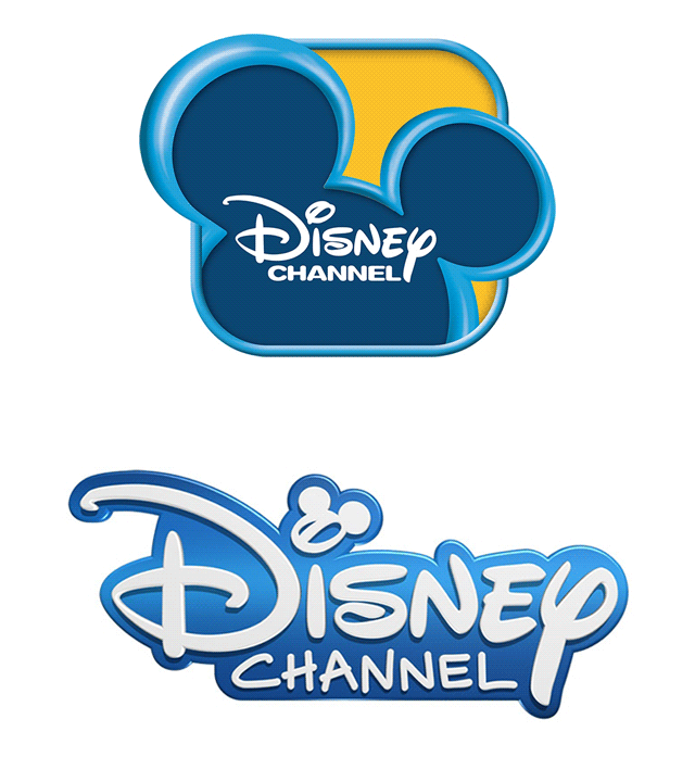
Disney Channel recently launched its new logo in the US and 42 other international networks, but there is one significant difference. While the old logo prominently featured the iconic mouse ears (read Mickey Mouse’s big round ears), the new one significantly reduces their size, showcasing a blue-and-white palette and revolving around Walt Disney’s signature.
The Channel isn’t exactly calling it a rebrand, but it has gone in for a logo refresh and its network IDs will reflect a new, more open (less boxy) look that is visible on most of its networks already. With the refresh in the look and feel the marketing team at the network is running helter-skelter to ensure that the channel’s new look is both consistent and sensible.
Disney Channels Worldwide sr. VP & CMO Richard Loomis in a statement said: “The new branding was an international collaboration between Disney Channel global and European teams and is crafted so our teams everywhere can customise it to create local stories, in familiar settings, featuring culturally identifiable storytelling.”
All interstitial programming, identification spots and programming menus will have the new logo, style and palette. The updated logo will combine the signature stroke of Walt Disney with the three-circle shape that resembles Mickey Mouse. The refresh is meant to celebrate the faces, families and environments of Disney Channel viewers worldwide, while honouring the history of the iconic brand.
“Our viewers have great affinity for two heritage elements that have long created a ‘story’ during our daily programming schedule – the four-note music mnemonic and the beloved ‘wand ID’ in which our stars form our Disney Mouse ears with a wand. We are looking forward to introducing these elements in an exciting new package,” further revealed Disney Channel VP marketing and creative Ron Pomerantz.
The agencies that have worked along with Disney for the logo refresh are Royale (in Los Angeles) and BDA (in Germany).
