“Production design is all about creating characters, their worlds and every tiny thing that you see in the background and on the screen,” claimed Sony Pictures Animation, production designer, Michael Kurinsky at the ABAI Fest and KAVGC Summit 2016.
Having helmed the art direction of Cloudy with a Chance of Meatballs (2009) and production design of the recent animated hit feature Hotel Transylvania 2, Michael Kurinsky explained his creative journey from designing just backgrounds and props to designing primary characters and creating the whole set in every sequence for an entire animated feature.
Kurinsky presented his predicament while working on art direction as he had to create a city which had to look pale and dull unlike a colourful phenomenal design that every art designer would intentionally create. He exclaimed, “In the Cloudy feature, I had to create a crappier or dull city which couldn’t be interesting at all. I personally wanted to design it with as many elements as possible but ultimately had to keep it without as many elements as possible; simple, dull and sad.”
The storyline of the film demanded a sad city and a beautiful lab of Flint Lockwood, the scientist who is the lead character of the film. “I designed my first colourful well lit lab for Flint and it was accepted right away. But, for the city, I had to design again and again till I could create something which was as dull as possible,” he added.

When it comes to Hotel Transylvania 2, Kurinsky already had a story with existing characters as the film was a sequel. The challenge lied where he had to create either new characters or new designs to match the level of the tremendous appeal that the first franchise demanded. “I couldn’t play around much with the characters or the whole set design like the look of the monster hotel because the audience loved the characters and set as they were. For example, Count Dracula had to be the same in the second film too for people loved the way he was in the first venture,” admitted Kurinsky.
But, the storyline of this second venture had a twist as it hosted a wedding plot and few additional characters like Mavis and Johnny’s son Dennis and also his great grandpa Vlad. “That’s where I got to play with the production, create something new and add my own touch to the story. We created Dennis as a mix of both Johnny and Mavis so he had hair like Johnny but eyes like Mavis. Similarly, Vlad depicted a story that he is a dracula who has been isolated therefore we created him and his whole palace in such a way that it resonated with his backstory,” he explained.
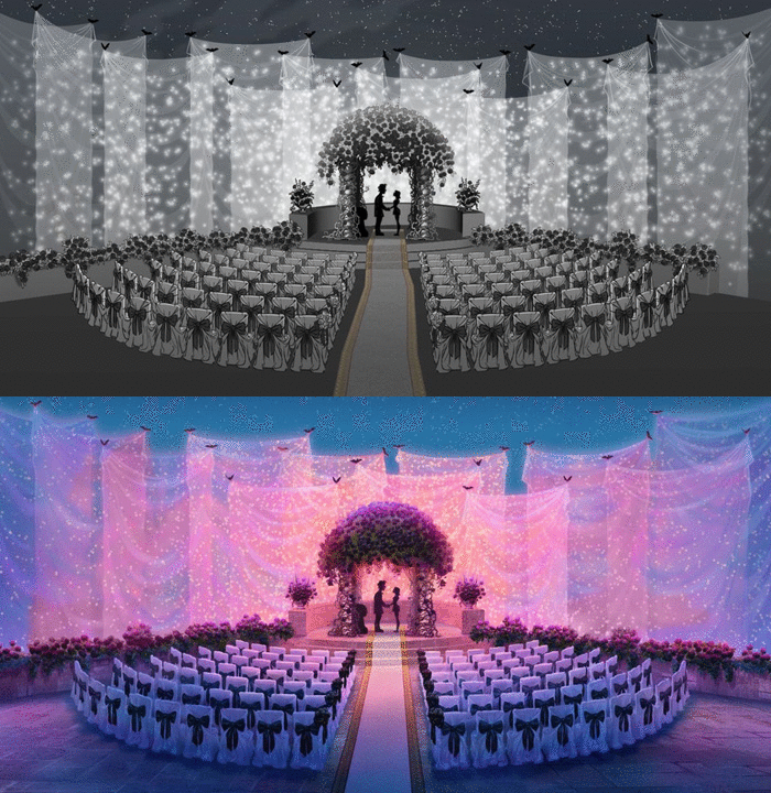
The dark creepy Hotel Transylvania was lit with bright pink colours as it featured the wedding of the vampire girl and the human boy. Therefore, the hotel couldn’t be entirely changed but it could be modified as Kurinsky and his team wanted the hotel to resonate an intense feel of a wedding ceremony and full of life sort of celebration.

Creating the vampire camp was another major task as the camp had to be isolated from sunlight and had to depict an old heritage look. Thus, huge walls were built surrounding the camp after a lot of research work was done as the script didn’t have in depth detail about the camp.
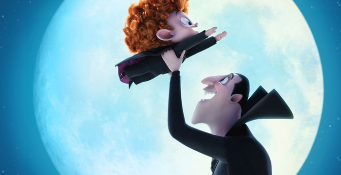
Colour and lighting play a huge role in production design as both these elements add radiating life to the characters, background, props and entire set design to bring alive the emotions. Every shot portrays a certain story similarly, every character depicts his/her features. He recollected, “The shot when Count Dracula lifts Dennis in his hands at a height with the moon in the background needed tremendous work of lighting. It had back light of the moon which showed the calm love bonding between the grandfather and grandson while the reactions of other monsters had a front lit view to convey panic and danger as the dracula was about to throw the kid from the high tower. Lighting enhanced the expressions in this sequence.”
Production design in an integral process of filmmaking as that’s where the whole sequence of the film is created as ‘characters meet the background’ in this process. The students present got this phenomenal opportunity to learn this integral process at the ABAI Fest 2016. In fact, this presentation provided a deep highlight into the work culture of a production and art designer in the professional field. “You can either paint 100 things or one thing in 100 different ways; both are fun,” was his parting message to the aspiring multitude at the ABAI fest and KAVGC Summit 2016.

