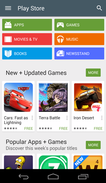
A new update to Play Store has fuelled the rumors about Google announcing an update to its Android OS – Android L, in a short while. Based on Material Design, this is the 5.0 version of the Play Store and sports a flatter look with use of bold, bright colours given to each category and carrying the same color scheme throughout the sub-categories.

 So the header of the Movies is bright red, Books will have blue and so on and so forth. The icon of the Play Store has also been traded for a new look with Google doing away with the all white 3D basket to a much flatter looking grey basket.
The folding looking motifs of the header categories have also been done away with. The focus is on the flatter look and Google is trying to blend in all of their apps to sport similar design UI which will feature in Android L. The ‘What’s new’ section has been relocated to the top of the interface which was earlier at the bottom of Read More. The hamburger icon on the top left is now much bigger with no option for category. Clicking on the icon opens the side menu, and the icon turns to back arrow with a little animation.
A lot has not been changed in the app other than the look but the app on the whole looks cleaner and the splash of colours feels fresh.
The update has not been rolled out just as yet but the enthusiast can download the update through a link here.

