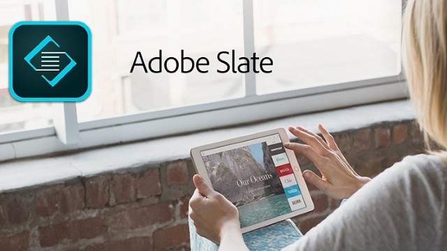
Adobe has been a developer of a series of softwares that provide experience to the users and with it each new application, it is transforming itself luring in more mobile users beyond just the professionals to use its software.
It has recently released a follow-up app of its last year’s Voice called Slate, which launched on iPad. Voice was used to make animated videos on iPad and Slate is structurally similar to Voice. It allows users to pull in photos from different cloud services and offers predesigned themes to choose from.

Rather than animation Slate uses a mixture of your still photos to create things like photo essays, newsletters, educational projects and digital invitations. Users can choose images from their iPad, Dropbox accounts and Adobe Cloud Libraries.
“We’re creating a family of tools,” said Adobe director of product management Brian Nemhauser.“Slate and Voice are just the start. And Adobe has a proven track record of knowing what people need for their communication.”
Gestures on Slate are limited and rearranging things by dragging and dropping is not the only option, which should be available, considering it is a very natural gesture for touchscreen devices. Focal point of each image can be adjusted with a finger, by tapping a small crosshair icon.
Finished Slate stories are saved to Adobe’s servers and can be shared from there. One can share a Web link that anyone – regardless of the person using Slate – can view.

