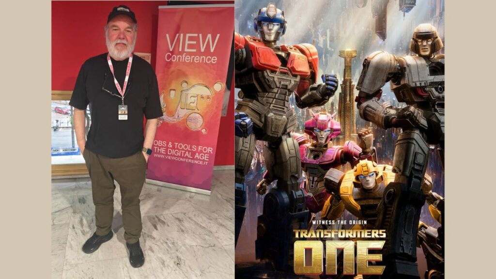
Known for his work with legends like George Lucas, this man’s journey into filmmaking is an inspiring story in itself. We are talking about Rob Coleman, the creative director and animation supervisor of Transformers One with ILM in Sydney. Renowned for leading large animation teams, Coleman has become an invaluable creative partner to filmmakers, bringing his extensive experience and a touch of magic to every project.
With Academy, BAFTA, and VES nominations under his belt, Coleman has worked on groundbreaking projects throughout his career, from The Mask and The LEGO Movie to his celebrated collaboration with Lucas on the Star Wars prequels. Yet, his journey into animation is one that feels like a cinematic experience of its own.
At the recently concluded VIEW Conference in Italy, AnimationXpress had the chance to listen to Coleman’s incredible journey and his insights on the creative process behind Transformers One.
Here are some highlights from that conversation:
You’ve had an extraordinary journey. What first drew you to the world of animation?
Well, it started when I was a little kid. My parents had this old 16mm projector, which was something back then—this was before VHS, before DVDs. We could borrow films from the National Film Board of Canada and from Disney, too. I remember sitting there, probably around five, watching Dumbo and just being in awe. Then, a few years later, I saw Mary Poppins, and there was Dick Van Dyke dancing with animated penguins, and that was pure magic to me.
Then, in my teenage years, I saw Star Wars and was just blown away. I was 16 when Raiders of the Lost Ark came out, and I remember talking non-stop about it. My dad said something that stuck with me: “Maybe one day you’ll work with George Lucas or Steven Spielberg.” Back then, I didn’t think much of it—I was just a kid who liked to draw. I actually went off to university for journalism first, but it just didn’t feel right. I realised I had to follow what I loved, so I switched to animation.
Fast forward to 1993, after I had a few years of experience and a decent demo reel, I sent it to ILM. I got an interview, and when they offered me the job, I told my dad. I took him out to dinner and said, “Remember when you said I might work with George Lucas? Well, I just got hired by ILM.” It was an emotional moment for both of us.
Let’s dive into Transformers One. Congratulations on the film! We’re curious—what made working on this project special, especially with ILM returning to feature animation?
Thank you! This project felt like coming full circle for me. I’d been with ILM for 12 years, then Lucasfilm Animation, but left to work on animated features. I loved animation, and eventually, I ended up in Australia, working with George Miller on Happy Feet Two and then heading up animation on The Lego Movie at Animal Logic. So, when ILM called to say they were returning to animated features and wanted me back in Sydney, I knew I had to jump at the opportunity. They were literally across the street from where I was working!
Collaborating with someone like Josh Cooley (Transformers One director) is a highlight in my 37-year career. Filmmakers who are as collaborative, creative, and story-focused as he is are rare. From our first meeting, I could tell that Josh had a real passion for this project. He shared that as a kid, he loved Transformers and played with the toys. I was confident in his ability to tell an emotional, human story with these characters, especially given his previous work on Toy Story 4.
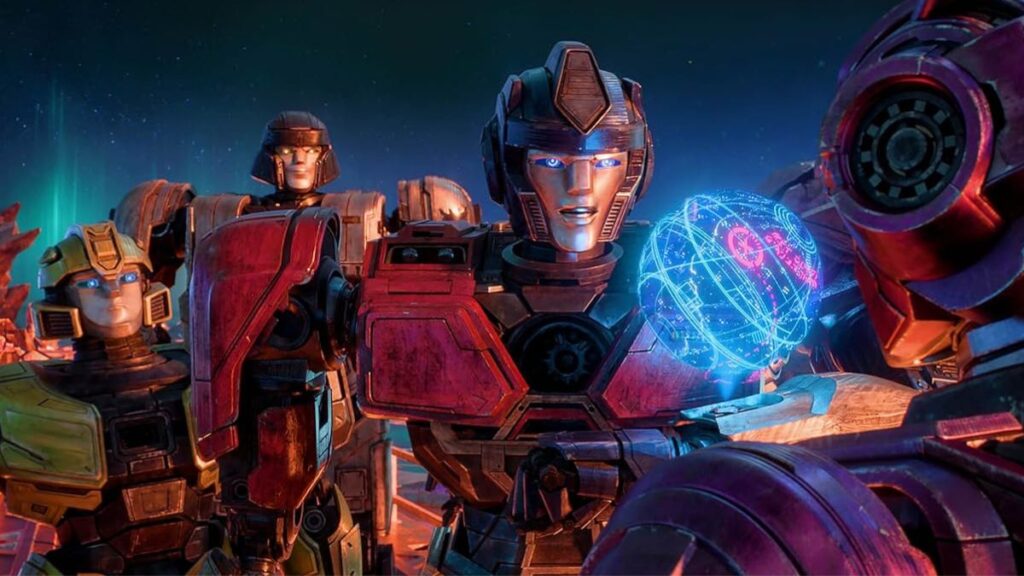
In our discussions about performance, Josh emphasised his desire for simplified faces that could convey nonverbal emotions. He wanted to create moments where the audience could connect with the characters, feeling their emotions and recognising that they were alive and thinking. I was all in—this is what I love to do. It was an absolute thrill to help Josh bring his vision to life.
The team in Sydney was ecstatic. They were eager to dive in and create entire environments because this film has no live-action; everything is designed, art-directed, and crafted to immerse the audience in the world of Cybertron and its inhabitants. My team loved working with Josh, and we were all a bit sad when it finished because it was such a rewarding experience.
The animation style in Transformers One has a very mature, almost live-action vibe. How did you achieve that distinct look?
The initial visual style came from the production designer Jason Scheier. He produced stunning concept paintings that served as a foundation for our team. Our visual effects supervisor, Frazer Churchill, and lighting supervisor, Francesco Sansoni, took Jason’s concepts and applied a live-action camera lens and lighting approach to them.
ILM has spent nearly 50 years perfecting the art of blending visual effects with live-action, so we took that expertise and applied it to Transformers One. We recalibrated our approach to focus on stylised realism rather than strict photorealism.
The team embraced the opportunity to work in this slightly different style, rooted in what real photography and cinematic lighting look like. We focused on ensuring that the audience’s attention was directed to the right elements by utilising techniques like defocusing certain aspects, placing objects in shadows, and using rim lighting with three-quarter backlighting on the characters for crisp edges. This knowledge, honed through years of visual effects work, was key in applying those principles to achieve our unique animation style.
Aside from Jason Scheier’s concept paintings, did you reference anything specific for the character designs?
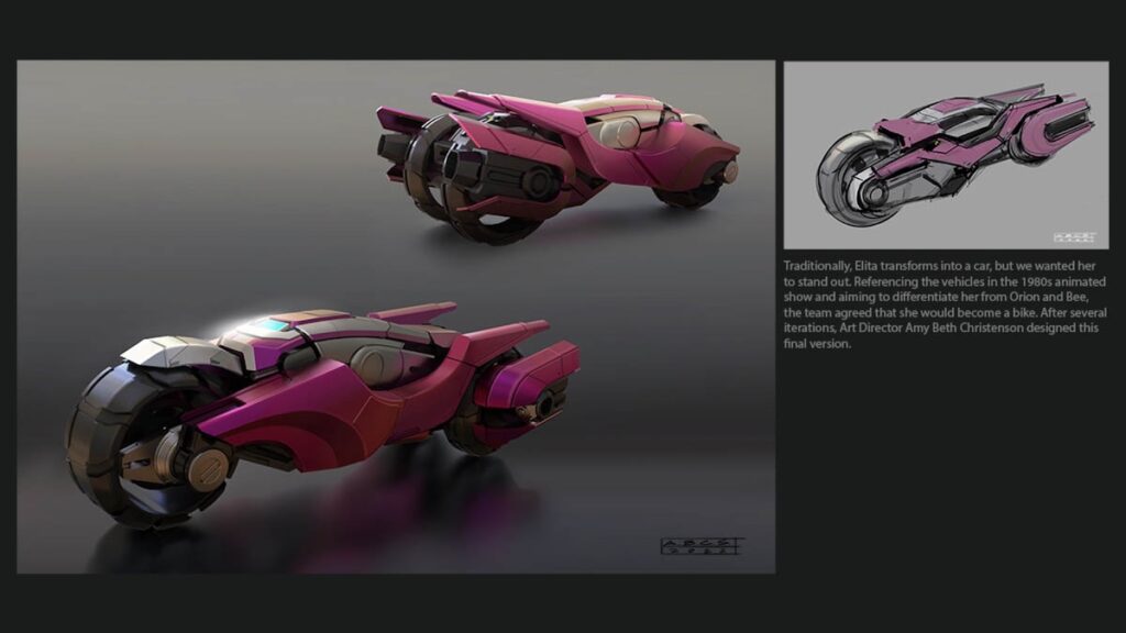
That was led by Amy Beth Christenson at ILM, who is a big Transformers fan herself. Her top priority was to make sure each character had a unique, recognisable silhouette. You could blur your eyes and still know exactly who you were looking at—B 127, or Bumblebee, with his rounder, plumper shape; D 16 aka Megatron, who’s taller, stronger, with broader shoulders; Orion Pax; and then Elita, who has an amazing design, which I personally love.
Each character has distinct colours and size variations, making them easy to tell apart visually. She paid close attention to graphic details, like the negative spaces between areas such as the torso and arms, and between the legs, creating clean, readable shapes. And then there’s the added complexity that each character has to transform from a bipedal (two-legged) form into a vehicle. Amy tackled the challenge of figuring out all the intricate geometry, reorienting parts to ensure they could transition seamlessly into vehicle. It was like solving a complex puzzle, and she pulled it off brilliantly.
You spoke about creating expressive, emotive faces on the Transformers. How did you make these robots convey human emotions?
We took inspiration from the 1980s Transformers series, where the robots’ faces were simple but very expressive. Josh wanted that same level of humanity, so we went with simplified, mechanical eyes—camera-like, almost—and focused on using small details like shutters to convey emotion. We also made the mouths versatile, so they could smile, frown, or show surprise just like a human face.
It began with initial drawings, then the modeling team sculpted a range of expression shapes. Afterward, the rigging team equipped animators with controls to smoothly transition from one expression to another. It’s fascinating how, with just a hint of expression, human viewers instinctively project emotions onto the faces, creating that emotional connection. That ability to ‘read’ human-like expressions was essential in how we brought these characters to life.
The metallic shine on the Transformers looks incredibly sleek yet natural. What was the design philosophy behind that polished look?
Our design approach was grounded in Transformers lore and the essence of Cybertron—a planet entirely made of metal, with various types that feel familiar to us, like painted metals, raw metals, chrome, and alloys that are silvery, gray, or gold. The art department at Paramount created detailed reference sheets showcasing different metal textures, with specific callouts indicating which areas of each Transformer would resemble copper, chrome, or gold.
From a design perspective, some metals were given a high polish for that sleek, reflective quality, like chrome, while others were matte or even slightly patinated to add depth. We added realistic wear and tear, like scuffs and scratches, which adds to the authenticity. People may not consciously notice every scuff mark, but it makes the characters feel grounded and real.
Was motion capture used, or was it primarily keyframe animation?
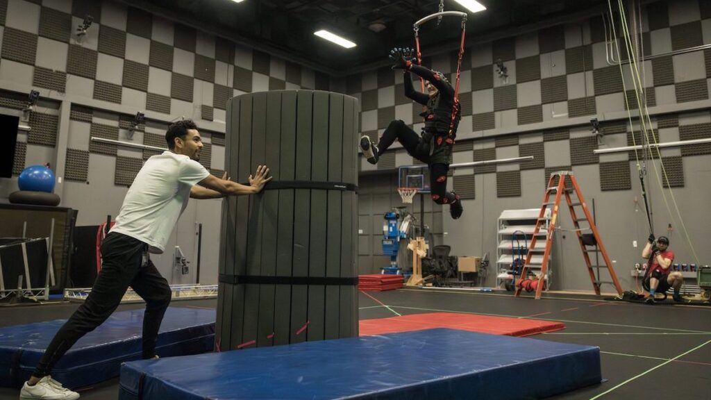
It was 100 per cent keyframe animation. But during the story phase, we used motion capture for what we called “virtual story reel” or VSR. At ILM San Francisco, where we have a motion capture stage, we had four actors in mocap suits. This allowed us to capture real-time body and facial movements, giving Josh the flexibility to block out scenes in real-time.
As each actor moved, we could see their corresponding character, like Elita, reacting in real-time on nearby monitors, set against a Cybertronian backdrop. This approach was especially helpful for dramatic scenes, where the traditional process would involve days of storyboarding.
Can you share the scope of the project in terms of the number of shots, artists involved, and the timeline?
We worked on 1,720 shots for the entire movie, covering around 250 assets and 94 environments. The film was in production for about three years. The initial phases included the art and story development, followed by the look and motion development phases, where we refined how everything would appear and perform. Once all these foundational elements were established, we moved into shot production, which took just over a year to complete.
With such complex elements, how did you ensure effective collaboration between teams?
The responsibility lies heavily on the senior leadership—our visual effects supervisor, animation supervisor, producer, and director—to ensure regular communication across departments. We held daily meetings, where we reviewed and discussed each aspect of the work to keep everyone aligned with the overall vision. These reviews helped reinforce the importance of every asset or acting moment, even for artists deeply focused on a single shot.
In addition to daily reviews, we met with the director twice a week, which provided direct feedback from him. He’d often highlight when something was working well or, conversely, if a moment felt rushed and needed to “breathe.” That iterative approach is essential to the creative process. Working with a collaborative director like Josh Cooley made a huge difference. He openly encouraged suggestions, saying, “I don’t have all the answers; I’m looking for the team to help me.” That kind of openness and trust isn’t universal, but it fosters a great creative environment.
What tools or techniques were critical in streamlining the workflows?
Efficiency is crucial in animation, so we use a three-pass system. First, we do the blocking pass to establish poses and timing, ensuring the shot fits with adjacent scenes. Once approved, we move to adding facial animations and refining movement.
After that, I present the work to Josh Cooley for feedback. He’ll either approve it or suggest adjustments, often pushing for stronger expressions. The final pass focuses on polishing, where we fix any remaining technical issues.
We manage this process across hundreds of shots simultaneously, with teams working in sequences. Dedicated production teams track progress, ensuring that each sequence hits its milestones, keeps pace, and integrates into the editorial’s working cut. This structured pipeline allows us to maintain quality across the project while keeping the workflow smooth and timely.
Having worked on iconic projects like The Mask, Star Wars, The LEGO Movie, and more, which one has been the most challenging and why?
The most challenging project was The Phantom Menace. I had previously worked as the animation supervisor on Men in Black, which had about 200 shots. Phantom Menace, however, was massive—over 2,000 shots. I was responsible for digital characters that were crucial to the story, but we faced major software limitations, especially with crowd scenes.
I felt overwhelmed and even reached out to George Lucas to express my concerns. I worried about the immense expectations from fans, but George reassured me by saying, “Forget the millions of viewers; focus on one person: me. If I’m happy with your work, that’s what matters.” That moment was surreal, especially since I was only 33 at the time.
You’ve worked across animated series, live-action films, and animated features. Which format do you enjoy working on the most and why?
I truly love the variety in my work. While I’m thrilled that ILM is back in the animated features space, I have a special place in my heart for live-action films. Having been nominated for two Oscars for visual effects, the experience of blending digital characters with live-action is pure magic for me. As I mentioned earlier, watching characters like Dick Van Dyke interact with animated penguins inspired me as a kid. When a digital character and a live-action character share the same space and the audience treats them as equals, that’s pure magic. That’s the essence of magic for me, and it’s what our company, Industrial Light and Magic, embodies. So whether it’s a series, a feature film, or an animated project, I’m just excited to create that magic.
What advice do you have for aspiring animators who want to work on large-scale projects at ILM or in feature animation?
My advice remains consistent: the best animators are keen observers of life. Pay attention to how people and animals move, how vehicles navigate, and replicate that in your work. To truly excel, you need to understand the characters on a deeper level.
For example, when two actors are conversing, notice the reactions of the one who isn’t speaking. Are they engaged, or is their mind elsewhere? How do their eyes, mouth, and head position convey their emotions? We talk about ‘text’—the words spoken by voice actors—and ‘subtext,’ which represents the characters’ thoughts and feelings.
You have to capture that complexity in your animation to make your characters feel alive. The goal is to create what Disney animators call the “illusion of life.” Infuse your humanity into your work, and you’ll create characters that resonate with audiences.
