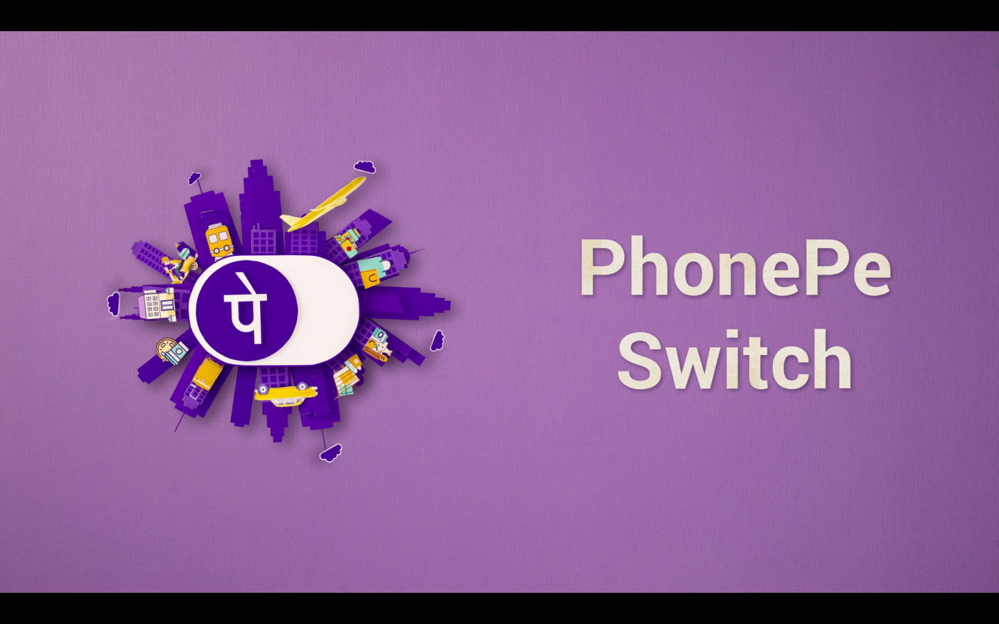
Post Office Studios has conceptualised and produced three animated films to launch the payments app, PhonePe’s, new feature PhonePe Switch. Post Office Studios created a launch film, along with an explainer video and eight use case videos to showcase the new feature. As both the explainer and use case videos were to be embedded within the app itself, they were designed to be simple, yet visually appealing, through the use of 2D animation.

PhonePe Switch focuses on three main benefits: Single App Solutions: which allows its users to get access to 65+ apps without individually downloading them, Fast Payments: which allows for payments to be made on just a single click, and Offers: cashbacks, coupons and exciting deals on online products.
The launch film being YouTube focussed, Post Office Studios took a more innovative route of stop motion animation for the same. Focussing on PhonePe’s three main benefits, the first five seconds of the video were visualised to be catchy and engaging, ensuring that the audience stays on long enough to take in adequate information about the app, without losing interest. To achieve this, three things were given utmost importance throughout: stunning visuals, an engaging script and music that holds everything together.

Post Office Studios creative director and director of the film Kunal Prabhu said, “PhonePe approached us to create content for the launch of their new feature called PhonePe Switch which allows users to access to 50+ apps without individually downloading them, makes faster payments while saving money by giving rewards and cashbacks to its users. The whole promotion was split into three parts, an introductory launch film, an explainer and eight use case videos.”
The PhonePe brand colours, purple and yellow, were used to define the visuals, in order to build brand recall for the audience to determine what would look appealing on screen with this color palette. “Since we were going ahead with stop motion animation, we had to not only ensure that our visuals were clearly fleshed out from the very beginning, but also that the music chosen went well with its flow, hitting the right highs and lows at all times,” mentioned Prabhu.
Since the team wanted to keep the audience glued to the screen, they had to create something unconventional and visually appealing. The explainer and use case videos needed to be simple and light as they were to be embedded in the app and uploaded on YouTube respectively, hence 2D animation was used to create those. Whereas, for the launch film, something innovative was brought to the table by using stop motion animation technique. “The final result is an ode to the beginning of all animation, where the animation flows in quirky manner to create a beautiful visual. A simple yet time taking and innovative technique that is easily retained in the audience’s memories,” Prabhu concluded.
The campaign is executive produced by Mitali Sharma, with creative director/scriptwriter Nandini Godara, creative producer Sakshi Bhasin, DOP Raza Mehta, chief AD Chinmaya Sharma, gaffer Sajid, stop motion animators Harsh Sharma, Adarsh Panicker, Esha Agarwal, clean ups Shikha Sharma, storyboard artists Adarsh Panicker, Anurag Chandra, editor Akhtar Shaikh, color grade Prabhu, sound mix and design Sharad Joshi. The team for explainer video and use case videos includes creative director Harsh Sharma, executive producer Kanchan Parikh, creative producer Ankur Chakravarty, script writer Rigved Siriah, storyboards Anisha Panicker, illustrations Panicker, Pankaj Gole, 2D animation Panicker, Vibha Lad and Neekhil Dighe, editor Akhtar Shaikh and VO artist Prachi Mayekar
The launch film has received over 18+ million views on YouTube alone, in less than a month since its release.

